

Introduction
In today’s world of information, data analysis skills have become vital for every professional working in various industries. If you own a business, do marketing, work in finance, or in another sphere, knowledge of data analysis can be an important advantage for your career. Most people believe that they require special software for data analysis. However, here is the good news: Excel for data analytics is quite a versatile tool that can perform much more than people think. For years, Microsoft Excel has been popular among business owners, students, and professionals all over the world. However, many people think that Excel is just a program for creating lists and simple tables. Nevertheless, with certain skills and knowledge, Excel turns into a powerful tool of trend analysis, pattern recognition, creating visuals, and taking decisions based on data. In this beginner’s guide, you will learn everything needed for data analysis using Excel.
Why Excel for Data Analytics?
Before diving into the technical aspects, let’s discuss why so many professionals choose Excel as their entry point into data analytics.
Accessibility and Familiarity
Excel is ubiquitous in the business world. Chances are, you already have it installed on your computer, and you’ve probably used it before. This makes the learning curve significantly gentler than jumping straight into specialized analytics software. You don’t need to invest in expensive licenses or spend weeks installing complex tools—Excel is ready to go.
Cost-Effectiveness
Unlike enterprise-level analytics platforms that can cost thousands of dollars annually, Excel requires minimal additional investment. If you have Microsoft Office, you already have everything you need to begin your data analytics journey.
Integration with Other Tools
Excel doesn’t exist in isolation. It integrates seamlessly with other Microsoft products like Power BI, Microsoft Access, and various cloud services. This means you can use Excel as a starting point and eventually scale up to more advanced analytics tools without losing your existing work.
Versatility
Excel for data analytics isn’t limited to one type of analysis. You can perform statistical analysis, create interactive dashboards, build predictive models, and generate professional reports—all within the same platform.
Essential Excel Features for Data Analytics
Now that we understand why Excel is valuable, let’s explore the key features that make it such a powerful tool for analytics work.
Pivot Tables: Your Analytics Powerhouse
Pivot tables are perhaps the most transformative feature in Excel for data analytics. They allow you to summarize large datasets quickly, reorganize data, and uncover hidden patterns without writing complex formulas.
A pivot table takes raw data and restructures it to answer specific questions. For example, if you have a spreadsheet containing thousands of sales transactions, you can create a pivot table to see total sales by region, product category, or time period in seconds. What would take hours to calculate manually happens instantly with pivot tables.
Creating your first pivot table is straightforward: select your data range, click on the pivot table button, and drag fields into the appropriate areas. Within minutes, you’ll have a clear summary of your data that’s both readable and actionable.
Formulas and Functions
Excel’s formula library is extensive, and learning key functions is crucial for data analytics. Here are some essential ones:
SUMIF and SUMIFS: These functions sum values based on specific criteria. For instance, you can calculate total revenue for a specific product or total sales in a particular region.
COUNTIF and COUNTIFS: Use these to count cells that meet certain conditions, helping you identify trends and measure occurrences.
VLOOKUP and INDEX-MATCH: These tools help you find and retrieve data from different parts of your spreadsheet or from other sheets entirely.
AVERAGE and AVERAGEIF: Calculate averages across your entire dataset or under specific conditions to understand typical values and performance metrics.
IF Statements: These create conditional logic, allowing you to categorize data or make calculations based on specific criteria.
Mastering these functions opens up countless analytical possibilities and eliminates the need for manual data processing.
Data Visualization with Charts
Raw numbers can be overwhelming, but transformed into visual formats, they tell compelling stories. Excel for data analytics includes various chart types—bar charts, line graphs, pie charts, scatter plots, and more.
The key to effective visualization is choosing the right chart type for your data. Are you comparing values across categories? A bar chart works best. Tracking trends over time? Line graphs are ideal. Showing parts of a whole? Pie charts are your friend.
Modern versions of Excel also feature smart charts that automatically adjust as your data changes, and you can apply professional formatting to make your visualizations publication-ready.
Getting Started: Setting Up Your Data
Before you can analyze data in Excel, you need to prepare it properly. Proper data setup is crucial for effective analytics work.
Clean Your Data
Data quality directly impacts analysis quality. Spend time cleaning your dataset by removing duplicates, fixing inconsistent entries, and addressing missing values. This foundation ensures your analyses are reliable and meaningful.
Organize Your Information
Arrange data in a table format with headers in the first row and data entries in subsequent rows. Each column should represent a specific variable, and each row should represent an individual record. This organization makes it easier to sort, filter, and analyze your data.
Use Named Ranges
Creating named ranges labels for specific cell groups makes formulas more readable and easier to manage. For example, “Revenue” is clearer than “C2:C1000,” especially when sharing workbooks with others.
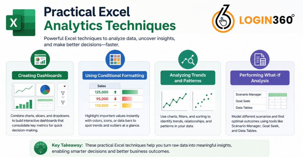
Practical Excel Analytics Techniques
Let’s explore practical applications of Excel for data analytics that you can implement immediately.
Creating Dashboards
Excel dashboards consolidate key metrics and visualizations into a single, easy-to-read view. A well-designed dashboard displays your most important performance indicators, allowing decision-makers to grasp the situation at a glance.
To build a dashboard, combine multiple charts, use slicers to filter data interactively, and apply conditional formatting to highlight important values. Advanced users can even incorporate dropdown menus to make dashboards dynamic and flexible.
Using Conditional Formatting
Conditional formatting automatically applies colors, icons, or data bars based on cell values. This visual approach makes patterns and outliers immediately apparent without requiring detailed examination of every number.
For instance, you might format sales figures so that numbers above a target appear green, while those below appear red. This instant visual feedback accelerates the analytical process and makes reports more impactful.
Analyzing Trends and Patterns
Use line charts to visualize trends over time, helping you identify whether metrics are improving, declining, or remaining stable. Scatter plots can reveal relationships between two variables, while filters and sorting functions help you isolate specific data subsets for deeper investigation.
Performing What-If Analysis
Excel’s what-if analysis tools including Scenario Manager, Goal Seek, and Data Tables let you model different situations without modifying your original data. This capability is invaluable for forecasting, budget planning, and decision-making.
Advanced Excel Tools for Analytics
Once you’ve mastered the basics of Excel for data analytics, these advanced features can elevate your analytical capabilities.
Statistical Analysis
Excel includes functions for standard deviation, correlation, regression analysis, and more. These statistical tools help you understand variability in your data, identify correlations between variables, and build predictive models.
Power Query
Power Query automates data import, transformation, and cleaning processes. Rather than manually manipulating data, you can set up queries that automatically handle repetitive tasks whenever new data arrives. This feature dramatically reduces manual work and ensures consistency.
Power Pivot
Power Pivot extends Excel’s data modeling capabilities, allowing you to work with massive datasets and create relationships between multiple tables. This feature bridges the gap between Excel and more sophisticated analytics platforms.
Data Analysis Toolpak
This add-in provides statistical analysis functions, including ANOVA, regression, and descriptive statistics. If you’re working on more complex analytical projects, activating this tool gives you powerful statistical capabilities within Excel.
Common Mistakes to Avoid
As you develop your Excel analytics skills, steer clear of these common pitfalls:
Overcomplicating Solutions: Excel makes it easy to build complex formulas, but simpler approaches are often better. If a pivot table can answer your question, use it instead of creating intricate formulas.
Neglecting Documentation: Always document your formulas, assumptions, and methodology. Future you and anyone reviewing your work will appreciate clear explanations of how analyses were conducted.
Ignoring Data Quality: Garbage in, garbage out. Invest time in data cleaning and validation before beginning your analysis.
Forgetting to Backup: Preserve your work regularly. A single corrupted file can mean losing hours of analytical work.
Mixing Data and Analysis: Keep raw data separate from your analytical work. Use different sheets or workbooks to maintain clarity and protect your source data.
Practical Example: Analyzing Sales Data
Let’s walk through a real-world scenario to tie everything together. Imagine you manage a retail business and have a spreadsheet with sales transactions from the past year, including date, product, region, salesperson, and amount.
Here’s how you might use Excel for data analytics:
- Organize the Data: Structure your data with headers in the first row and transactions in subsequent rows.
- Create a Pivot Table: Summarize total sales by region and product category to identify your best-performing areas.
- Build Visualizations: Create bar charts showing sales by region and line charts tracking sales trends over time.
- Apply Formulas: Use SUMIFS to calculate regional totals and COUNTIF to count transactions by salesperson.
- Add Filters: Enable filtering to explore specific date ranges, products, or regions.
- Create a Dashboard: Combine your charts and key metrics on a single dashboard sheet for executive review.
- Use Conditional Formatting: Highlight regions or products that exceeded or fell short of targets.
Learning Resources and Next Steps
Your Excel analytics journey doesn’t end here. Consider exploring these resources:
- Online Tutorials: YouTube channels and websites offer free Excel tutorials covering everything from basics to advanced techniques.
- Practice Datasets: Websites like Kaggle provide free datasets you can use to practice your skills.
- Microsoft’s Official Documentation: Excel’s built-in help system and official Microsoft resources provide authoritative guidance.
- Online Courses: Structured courses from platforms like Coursera, Udemy, or LinkedIn Learning can accelerate your learning.
- Excel Communities: Join online forums and communities where you can ask questions and learn from experienced users.
Conclusion
Excel for data analytics is a highly effective tool that helps professionals at all levels gain valuable insights from their data. From pivot tables and formulas to visualizations and dashboards, Excel provides everything beginners need to start their analytics journey without the hassle or expense of specialized software. The advantage of learning data analytics with Excel is that it’s a practical and relaxed way to introduce analytical thinking. You’ll develop skills that you can use on more advanced platforms while solving real business problems right away. Whether you’re tracking sales, analyzing customer behavior, monitoring project metrics, or exploring any data-related questions, Excel gives you the tools to find answers. Start small by cleaning your first dataset, creating a pivot table, and building a simple chart. As you become more comfortable with these basics, you can explore advanced features at your own speed. Before long, you’ll be creating insightful dashboards and impressing colleagues with data-driven recommendations. The world increasingly values those who can understand data. Excel is an accessible and powerful way to join that conversation. Start today, and you’ll quickly find that data analytics isn’t as daunting as it seems; it’s an exciting, practical skill that leads to better decision-making and career growth.